• Work
  • People
  • Capabilities
  • Energy
  • Story
  • Blog
  • Contact
More Branding, Marketing and Advertising, Tulsa, OK
  • Work
  • People
  • Capabilities
  • Energy
  • Story
  • Blog
  • Contact

Oklahoma Wesleyan University - New Athletic Brand Takes Flight

We are excited to showcase the new athletic brand we developed with Oklahoma Wesleyan University. Their old logo had become dated and proved to be difficult to work with in the various applications a collegiate athletic brand needs to function in today's culture. In college athletics it is important to have an extended brand family that can be consistently implemented across all sports, marketing and ultimately merchandising for the fan base and alumni.

We wanted an eagle that was aggressive and in motion taking cues from Isaiah 40:31: "those who hope in the LORD will renew their strength. They will soar on wings like eagles; they will run and not grow weary, they will walk and not be faint." We also subtly integrated a cross into the tail feathers as a reminder of the ultimate truth and sacrifice.

Mark Molder, Athletic Director, said of the launch, 

“This is a great change for our athletic department and the university as we move into the Kansas Collegiate Athletic Conference. This new logo, and the options that come with it, will set us apart.”

The coaching staff as a whole is excited about the logo and what it means for the University. Coach T.J. Dickinson summed up the coaches’ views of the logo, saying, 

“the end result is a consistent look for all of our programs that helps tie in the proud tradition of OKWU athletics with a new modern touch.”

The logo will transition into the athletic program throughout the coming months, beginning with giveaways and a website re-launch at the new okwueagles.com later this week.

tags: sports logo, sports branding, university athletics branding, collegiate athletics branding, oklahoma wesleyan university athletics brand
Thursday 06.25.15
Posted by Justin Johnson
 

The Role of the Nonprofit Brand

In the past, nonprofit executives viewed brands as merely a marketing communication tool. They felt it helped increase visibility in their communities, positioned them better against competitors and helped with recognition that would evolve into better fundraising. All of these things are true but the perception was that a nonprofit's brand primarily existed for external purposes. 

Branding is not just a marketing department issue. It is crucial that the executive team is engaged from the beginning. Today, executive directors realize that brands have a much more strategic role improving an organization's performance. A nonprofit brand can and should create changes internally. It must authentically express the organization's purpose, mission and values. Oftentimes, this is where the value of a rebrand is created - forcing nonprofits to make time to think about why they exist, where they are going and how they are going to get there.

As you approach rebranding your nonprofit, make sure the person/group you are hiring understands that a brand is not just a name, logo or visual look of your organization. Strategy, operations and branding must be aligned. When these three elements are working together nonprofits maintain a laser-like focus on the mission, reduce busyness and clear away noise that distracts from achievement. Branding often includes bringing different factions together, redirecting people internally toward a shared goal, changing the way you describe your services, removing service creep and aligning with your long-term strategy. It is most definitely not just a marketing department issue.


tags: nonprofit brand, branding nonprofits, tulsa nonprofit brand, nonprofit branding tulsa
Monday 01.19.15
Posted by Justin Johnson
Comments: 1
 

6 Simple Tactics We Used to Tell a More Engaging Brand Story.

At More Branding, we approach Storytelling with the core belief that every detail matters. If it doesn't matter then it needs to be eliminated. One of the simplest ways to more powerfully communicate your story is to thoughtfully implement production techniques and/or materials that strengthen your message.


Here are six ways we strategically used materials to strengthen the message:

CypressCreek.jpg

1: Cypress Creek Renewables: We recently created a brand for Cypress Creek Renewables. They are a solar development financing company. The special technique we used to bridge solar technology and financing was holographic foil. The hologram interacts with the light reminding you of the solar focus while also feeling secure like the security holograms on your checks, credit cards and drivers licenses. It's a witty solution that had no additional costs compared to a standard silver or gold foil stamp.


3.jpg
2.jpg

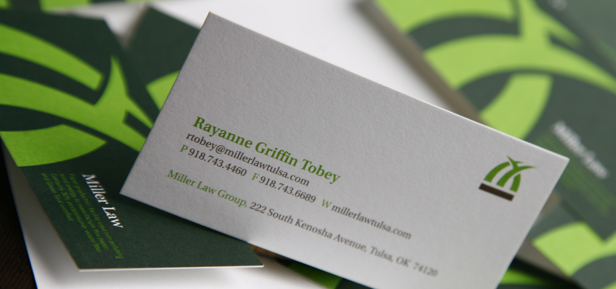
2: Miller Law Firm: An environmental law firm based in Tulsa not only practiced law to protect the environment they wanted to live it with their brand and materials. One simple solution was to use paper that was produced in a facility that used wind energy, contained post-consumer waste and was Green Seal certified. In order to communicate their commitment to their cause we told people about their conscious paper decision right on the stationery. 


MoreMovingAnnouncement_08v2.jpg

3: Moving Announcement: We needed to tell our clients and business contacts that we were relocating our offices to the 10th floor. Our solution was to up cycle our moving boxes by simply screenprinting the announcement right on the cardboard and dropping it in the mail.


IMG_0903jj.jpg

4: Liquid Compass: This company was founded to help people find their way personally and in business. Liquid Compass would them through a strategic self-discovery method process. When we developed their materials we didn't print ink we simply debossed the information. This created interaction and forced potential clients to think differently. It turned out to be a great tool for culling potential clients that weren't open to change and wouldn't benefit from the effort.


"Not all problems are easy to see." "Make it more visible by lending your support."

"Not all problems are easy to see." "Make it more visible by lending your support."

"Ignoring it won't make it go away." "Make it more visible by lending your support."

"Ignoring it won't make it go away." "Make it more visible by lending your support."

5: Child Abuse Network: We wanted to expose people to the sometimes hidden topic that Child Abuse is real, it's happening and just because it's difficult to see doesn't mean it's not there. We created a series of posters that made the viewer look hard for the message and then asked them for their support to help make others more aware of the problem.


CoxBusiness_onlineads.jpg

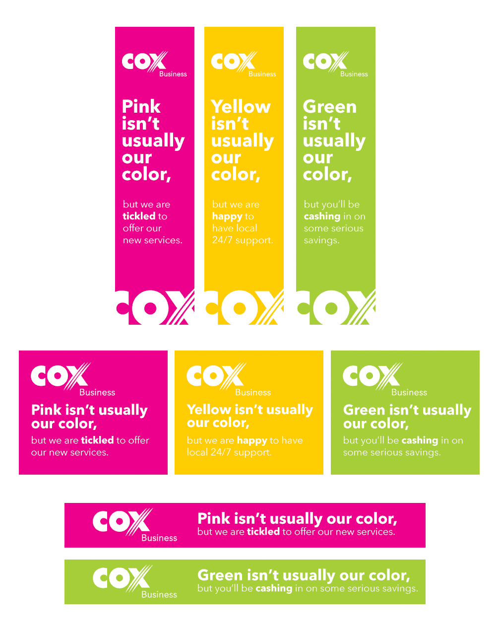
6: Cox Business Cable: Here is a digital one for you. Cox identified a perfect website to advertise their products, promotions and services but there was a big problem. The entire website was blue and all of their advertising had traditionally used the same Cox blue which was their corporate color. Their ads receded into the website and essentially became invisible. We convinced them to do a guerrilla type campaign using the brightest colors possible, weaving in a supporting message and becoming the most visible content on the site.

The click-rate was the highest we had ever seen with Cox Business - people had never associated Cox with anything but blue and this peaked their interests and enticed them to click. "When websites give you lemons make lemonade?"

Tag Cloud Block
This is an example. Double-click here and select a page to create a cloud of its tags or categories. Learn more
  • Art
  • Handmade
  • Inspired
  • Playlist
  • Pro Tip
  • Things to Do
tags: storytelling, branding, engaging, design, creative, techniques, problem solving
Sunday 06.08.14
Posted by Justin Johnson
Comments: 1
 

© More Branding+Communication, Inc.
There's Always More to the Story.